Work Contact
Mika—Process
01 Typeface
01 Typeface
01 Typeface
01 Typeface
01 Typeface
01 Typeface


Sketches & Robofont
Sketches & Robofont
Sketches & Robofont
Sketches & Robofont
Sketches & Robofont
Sketches & Robofont
01 Intro
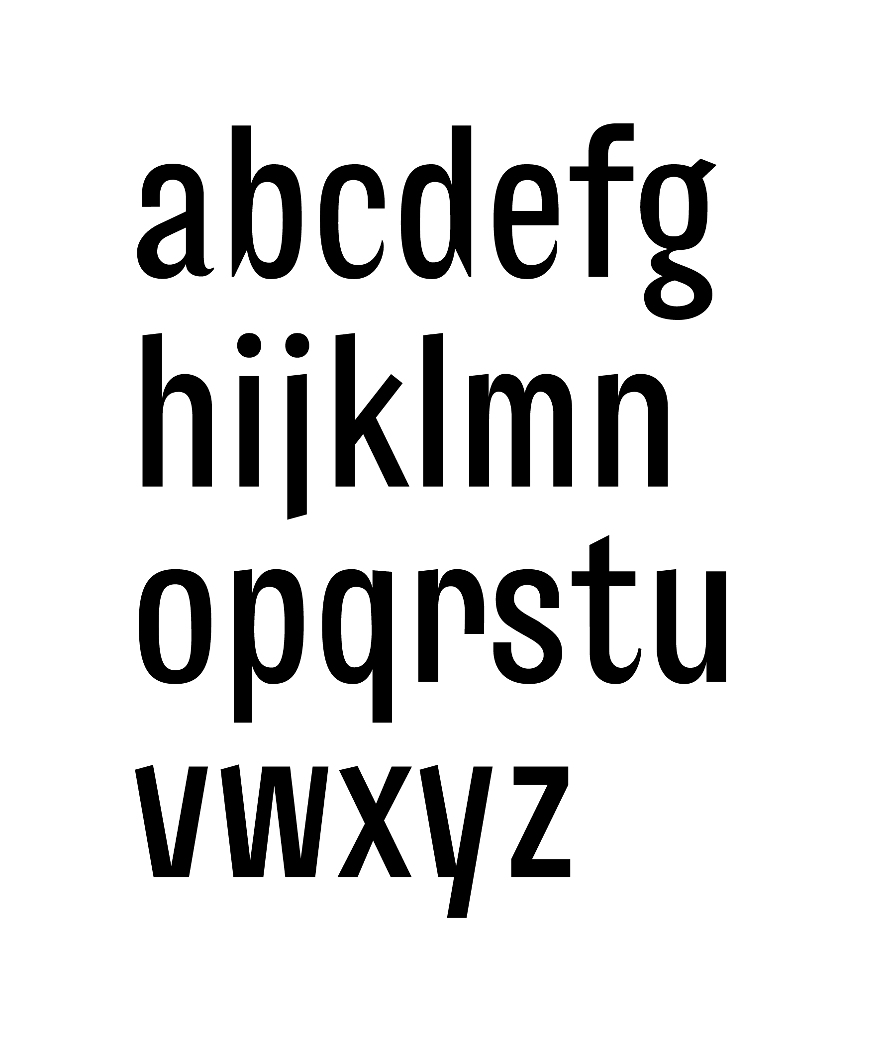
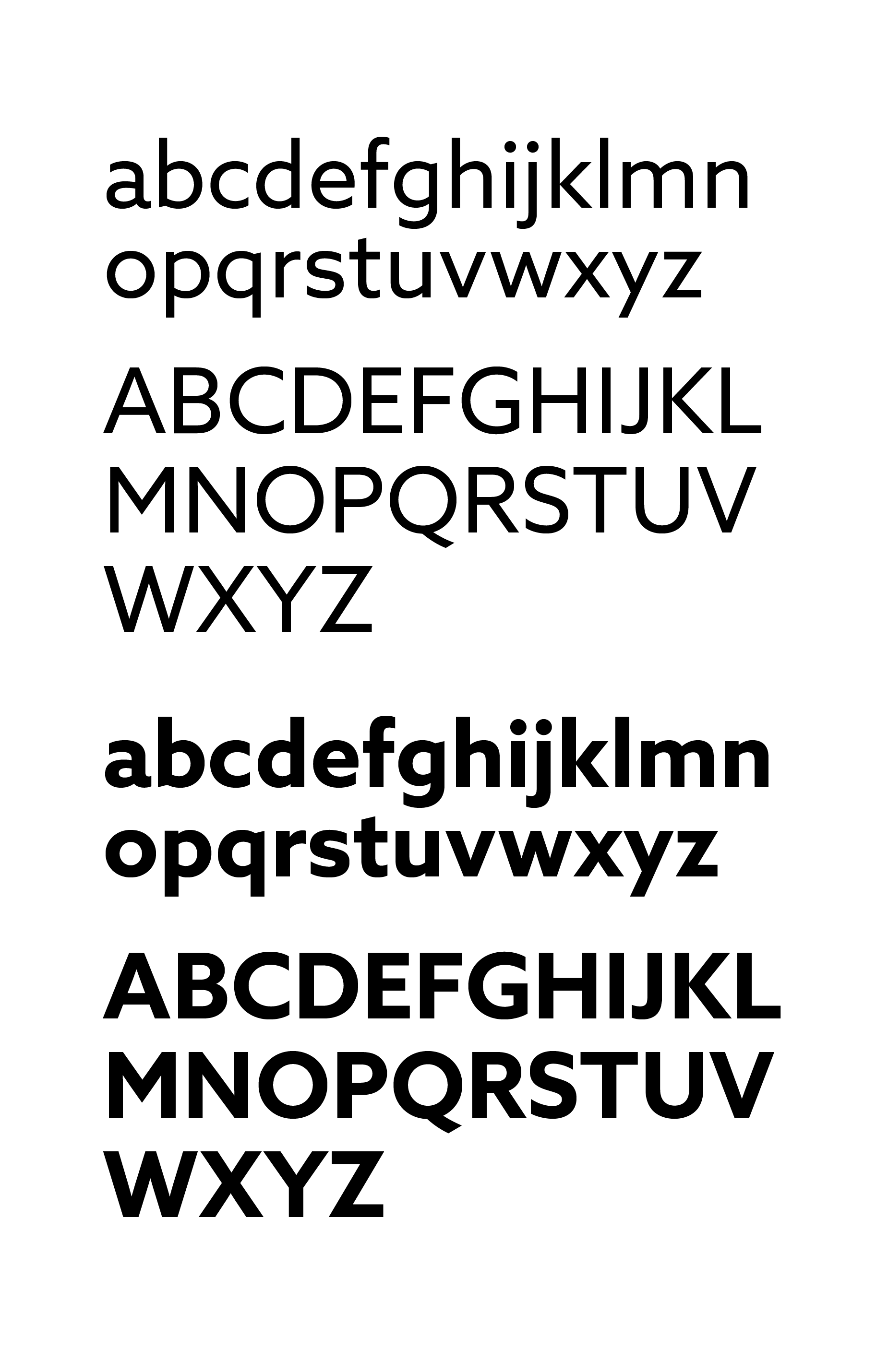
This project is based on a typeface I designed during a course through Type@Cooper. I wanted to design a sans-serif typeface, something pragmatic and contemporary, yet not completely void of character. By incorporating aspects of traditional writing and other idiosyncratic details to select letterforms, the typeface possesses a sense of humanity and playfulness.
Mika is a direct extension of my typeface because it is a product and experience that needs to be coherent and straightforward yet not without humanity, playfulness and joy.
01 Intro
01 Intro
01 Intro
01 Intro
01 Intro
This project is based on a typeface I designed during a course through Type@Cooper. I wanted to design a sans-serif typeface, something pragmatic and contemporary, yet not completely void of character. By incorporating aspects of traditional writing and other idiosyncratic details to select letterforms, the typeface possesses a sense of humanity and playfulness.
Mika is a direct extension of my typeface because it is a product and experience that needs to be coherent and straightforward yet not without humanity, playfulness and joy.
A sans-serif typeface that is pragmatic and contemporary, yet also playful and human with idiosyncratic details applied to select letterforms.
A sans-serif typeface that is pragmatic and contemporary, yet also playful and human with idiosyncratic details applied to select letterforms.
A sans-serif typeface that is pragmatic and contemporary, yet also playful and human with idiosyncratic details applied to select letterforms.
A sans-serif typeface that is pragmatic and contemporary, yet also playful and human with idiosyncratic details applied to select letterforms.
A sans-serif typeface that is pragmatic and contemporary, yet also playful and human with idiosyncratic details applied to select letterforms.
A sans-serif typeface that is pragmatic and contemporary, yet also playful and human with idiosyncratic details applied to select letterforms.
A sans-serif typeface that is pragmatic and contemporary, yet also playful and human with idiosyncratic details applied to select letterforms.
A sans-serif typeface that is pragmatic and contemporary, yet also playful and human with idiosyncratic details applied to select letterforms.

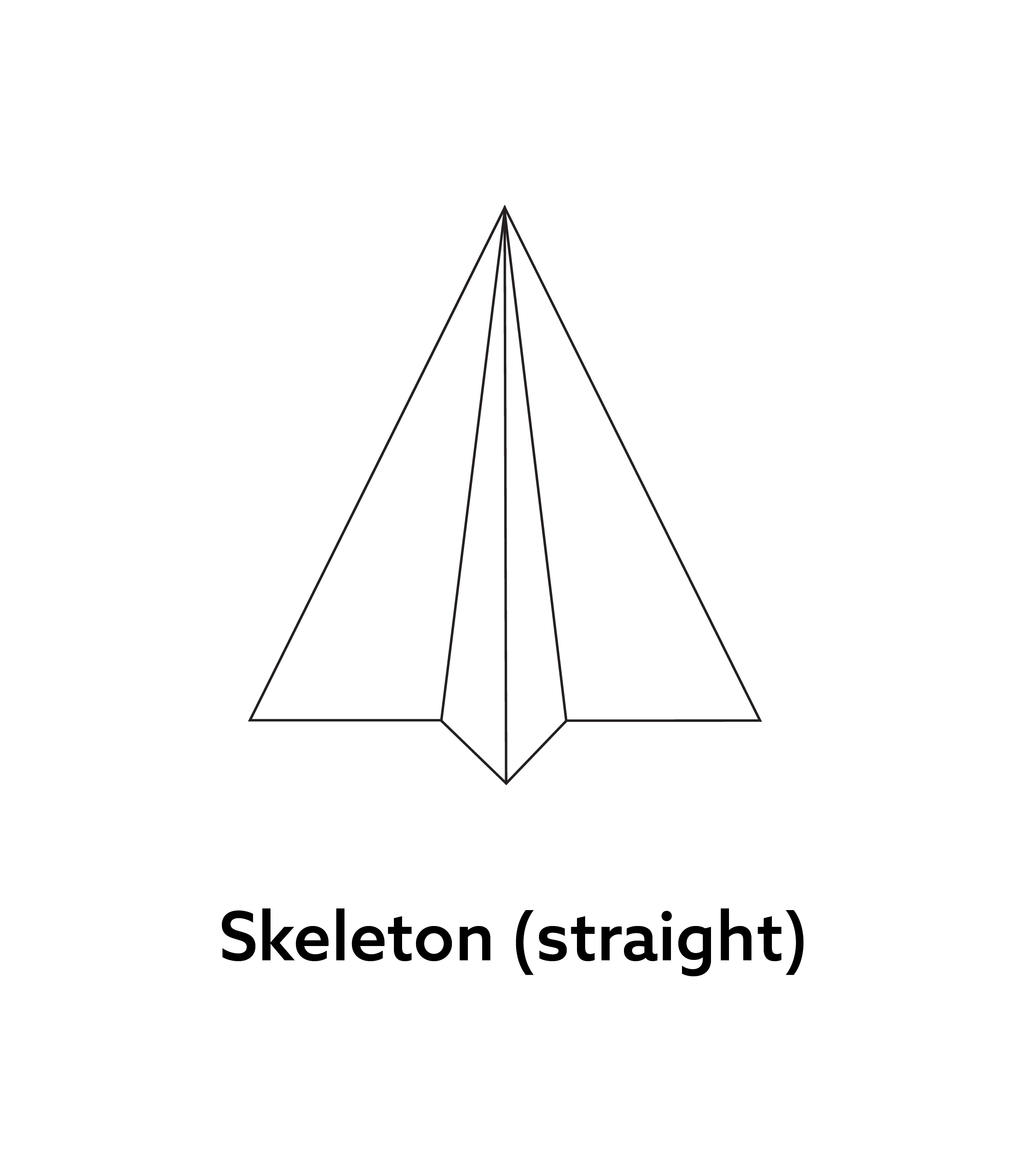
The contrast here is reminiscent of traditional writing.
The contrast here is reminiscent of traditional writing.
The contrast here is reminiscent of traditional writing.
The contrast here is reminiscent of traditional writing.
The contrast here is reminiscent of traditional writing.
The contrast here is reminiscent of traditional writing.
The contrast here is reminiscent of traditional writing.
The contrast here is reminiscent of traditional writing.

The contrast here is reminiscent of expansion writing.
The contrast here is reminiscent of expansion writing.
The contrast here is reminiscent of expansion writing.
The contrast here is reminiscent of expansion writing.
The contrast here is reminiscent of expansion writing.
The contrast here is reminiscent of expansion writing.
The contrast here is reminiscent of expansion writing.
The contrast here is reminiscent of expansion writing.

The contrast here is reminiscent of expansion writing.
The contrast here is reminiscent of expansion writing.
The contrast here is reminiscent of expansion writing.
The contrast here is reminiscent of expansion writing.
The contrast here is reminiscent of expansion writing.
The contrast here is reminiscent of expansion writing.
The contrast here is reminiscent of expansion writing.
The contrast here is reminiscent of expansion writing.

The contrast here is reminiscent of expansion writing.
The contrast here is reminiscent of expansion writing.
The contrast here is reminiscent of expansion writing.
The contrast here is reminiscent of expansion writing.
The contrast here is reminiscent of expansion writing.
The contrast here is reminiscent of expansion writing.
The contrast here is reminiscent of expansion writing.
The contrast here is reminiscent of expansion writing.

The sharp point here creates moments of brightness throughout a body of text.
The sharp point here creates moments of brightness throughout a body of text.
The sharp point here creates moments of brightness throughout a body of text.
The sharp point here creates moments of brightness throughout a body of text.
The sharp point here creates moments of brightness throughout a body of text.
The sharp point here creates moments of brightness throughout a body of text.
The sharp point here creates moments of brightness throughout a body of text.
The sharp point here creates moments of brightness throughout a body of text.

All of the diagonals have one end that is slanted, giving the typeface a playful and funky vibe.
All of the diagonals have one end that is slanted, giving the typeface a playful and funky vibe.
All of the diagonals have one end that is slanted, giving the typeface a playful and funky vibe.
All of the diagonals have one end that is slanted, giving the typeface a playful and funky vibe.
All of the diagonals have one end that is slanted, giving the typeface a playful and funky vibe.
All of the diagonals have one end that is slanted, giving the typeface a playful and funky vibe.
All of the diagonals have one end that is slanted, giving the typeface a playful and funky vibe.
All of the diagonals have one end that is slanted, giving the typeface a playful and funky vibe.

The contrast here is reminiscent of expansion writing.

The sharp point here creates moments of brightness throughout a body of text.

All of the diagonals have one end that is slanted, giving the typeface a playful and funky vibe.

The contrast here is reminiscent of traditional writing.

The contrast here is reminiscent of expansion writing.

The contrast here is reminiscent of expansion writing.


02 Logo
02 Logo
02 Logo
02 Logo
02 Logo
02 Logo


01
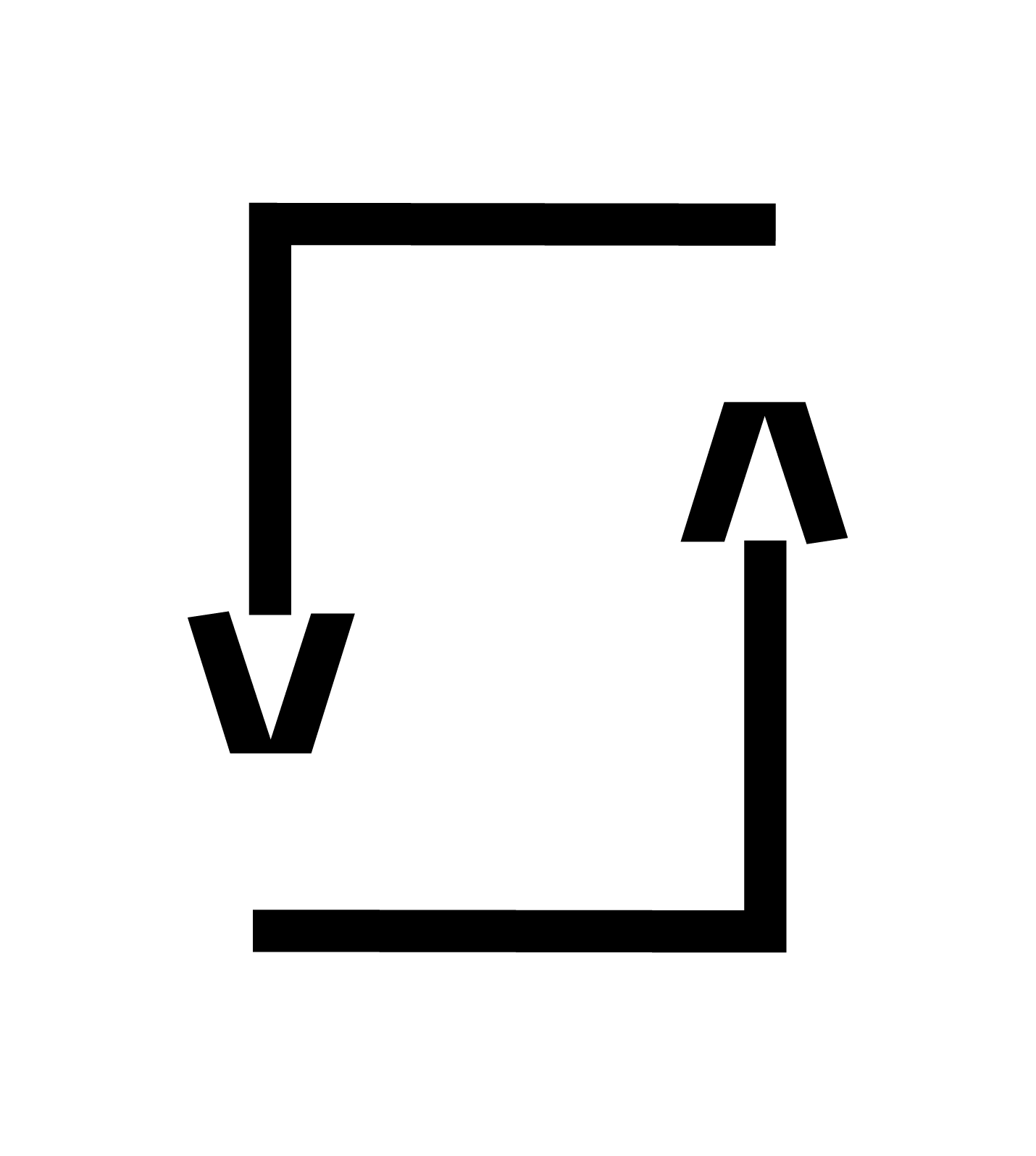
A symbol of communication and forward motion.
A symbol of communication and forward motion.
A symbol of communication and forward motion.
A symbol of communication and forward motion.
A symbol of communication and forward motion.
A symbol of communication and forward motion.
A symbol of communication and forward motion.
A symbol of communication and forward motion.
02

03

04

05

06

Additional thoughts
To pass a note or send a message = Communication
A single thing composed of distinct parts (colors) = Collaboration
Pointing upwards = Positive results
Flying = Feel good
Simple, unembellished = Straightforward and simple
Additional thoughts
To pass a note or send a message = Communication
A single thing composed of distinct parts (colors) = Collaboration
Pointing upwards = Positive results
Flying = Feel good
Simple, unembellished = Straightforward and simple
Additional thoughts
To pass a note or send a message = Communication
A single thing composed of distinct parts (colors) = Collaboration
Pointing upwards = Positive results
Flying = Feel good
Simple, unembellished = Straightforward and simple
Additional thoughts
To pass a note or send a message = Communication
A single thing composed of distinct parts (colors) = Collaboration
Pointing upwards = Positive results
Flying = Feel good
Simple, unembellished = Straightforward and simple
Additional thoughts
To pass a note or send a message = Communication
A single thing composed of distinct parts (colors) = Collaboration
Pointing upwards = Positive results
Flying = Feel good
Simple, unembellished = Straightforward and simple
Additional thoughts
To pass a note or send a message = Communication
A single thing composed of distinct parts (colors) = Collaboration
Pointing upwards = Positive results
Flying = Feel good
Simple, unembellished = Straightforward and simple
Additional thoughts
To pass a note or send a message = Communication
A single thing composed of distinct parts (colors) = Collaboration
Pointing upwards = Positive results
Flying = Feel good
Simple, unembellished = Straightforward and simple
Additional thoughts
To pass a note or send a message = Communication
A single thing composed of distinct parts (colors) = Collaboration
Pointing upwards = Positive results
Flying = Feel good
Simple, unembellished = Straightforward and simple
Additional thoughts
To pass a note or send a message = Communication
A single thing composed of distinct parts (colors) = Collaboration
Pointing upwards = Positive results
Flying = Feel good
Simple, unembellished = Straightforward and simple

03 Color
03 Color
03 Color
03 Color
03 Color
03 Color
Azure
#027EF7
Azure
Azure
#027EF7
Azure
#027EF7
Azure
#027EF7
Azure
#027EF7
Azure
#027EF7
#027EF7
Spring Green
#36FE93
Vivid Sky Blue
#04D2FF
Violet
#FF89FC
Spring Green
#36FE93
Spring Green
#36FE93
Spring Green
#36FE93
Spring Green
#36FE93
Spring Green
#36FE93
Spring Green
#36FE93
Vivid Sky Blue
#04D2FF
Vivid Sky Blue
#04D2FF
Vivid Sky Blue
#04D2FF
Vivid Sky Blue
#04D2FF
Vivid Sky Blue
#04D2FF
Vivid Sky Blue
#04D2FF
Violet
#FF89FC
Violet
#FF89FC
Violet
#FF89FC
Violet
#FF89FC
Violet
#FF89FC
Violet
#FF89FC
Bright saturated colors for a youthful audience. Playful and cheerful, yet also cold and techy.
Bright saturated colors for a youthful audience. Playful and cheerful, yet also cold and techy.
Bright saturated colors for a youthful audience. Playful and cheerful, yet also cold and techy.
Bright saturated colors for a youthful audience. Playful and cheerful, yet also cold and techy.
Bright saturated colors for a youthful audience. Playful and cheerful, yet also cold and techy.
Bright saturated colors for a youthful audience. Playful and cheerful, yet also cold and techy.
Bright saturated colors for a youthful audience. Playful and cheerful, yet also cold and techy.
Bright saturated colors for a youthful audience. Playful and cheerful, yet also cold and techy.
Poppy
#D64144
Coral
#FA834C
Saffron
#E7BB41
Icterine
#FEFF88
Supplementary Colors
Mostly for use in UI to allow for greater versatility in color application.
Poppy #D64144
Poppy #D64144
Poppy #D64144
Poppy #D64144
Poppy #D64144
Poppy #D64144
Poppy #D64144
Poppy #D64144
Coral #FA834C
Coral #FA834C
Coral #FA834C
Coral #FA834C
Coral #FA834C
Coral #FA834C
Coral #FA834C
Coral #FA834C
Saffron #E7BB41
Saffron #E7BB41
Saffron #E7BB41
Saffron #E7BB41
Saffron #E7BB41
Saffron #E7BB41
Saffron #E7BB41
Saffron #E7BB41
Icterine #FEFF88
Icterine #FEFF88
Icterine #FEFF88
Icterine #FEFF88
Icterine #FEFF88
Icterine #FEFF88
Icterine #FEFF88
Icterine #FEFF88
Supplementary Colors
Mostly for use in UI to allow for greater versatility in color application.
Supplementary Colors
Mostly for use in UI to allow for greater versatility in color application.
Supplementary Colors
Mostly for use in UI to allow for greater versatility in color application.
Supplementary Colors
Mostly for use in UI to allow for greater versatility in color application.
Supplementary Colors
Mostly for use in UI to allow for greater versatility in color application.
Supplementary Colors
Mostly for use in UI to allow for greater versatility in color application.
Supplementary Colors
Mostly for use in UI to allow for greater versatility in color application.
Supplementary Colors
Mostly for use in UI to allow for greater versatility in color application.
04 Typefaces
04 Typefaces
04 Typefaces
04 Typefaces
04 Typefaces
04 Typefaces
Azo Sans
At first, I wanted to use the typeface I designed for Mika's UI and web, but I was advised by a product designer to use a sans-serif typeface with less personality.
Azo sans
At first, I wanted to use the typeface I designed for Mika's UI and web, but I was advised by a product designer to use a sans-serif typeface with less personality.
Azo sans
At first, I wanted to use the typeface I designed for Mika's UI and web, but I was advised by a product designer to use a sans-serif typeface with less personality.
Azo sans
At first, I wanted to use the typeface I designed for Mika's UI and web, but I was advised by a product designer to use a sans-serif typeface with less personality.
Azo sans
At first, I wanted to use the typeface I designed for Mika's UI and web, but I was advised by a product designer to use a sans-serif typeface with less personality.
Azo Sans
At first, I wanted to use the typeface I designed for Mika's UI and web, but I was advised by a product designer to use a sans-serif typeface with less personality.
Azo Sans
At first, I wanted to use the typeface I designed for Mika's UI and web, but I was advised by a product designer to use a sans-serif typeface with less personality.
Azo sans
At first, I wanted to use the typeface I designed for Mika's UI and web, but I was advised by a product designer to use a sans-serif typeface with less personality.
Azo sans
At first, I wanted to use the typeface I designed for Mika's UI and web, but I was advised by a product designer to use a sans-serif typeface with less personality.

Azo sans
Minion Variable Concept
Minion Variable Concept
Minion Variable Concept
Minion Variable Concept
Minion Variable Concept
Minion Variable Concept
Minion Variable Concept


Minion Variable Concept
05 Graphic Elements
05 Graphic Elements
05 Graphic Elements
05 Graphic Elements
05 Graphic Elements
05 Graphic Elements
Graphic Elements
Graphic Elements
Graphic Elements
Graphic Elements
Graphic Elements
Graphic Elements
Graphic Elements

01

02

03

04

06


05

Graphic Elements & UI
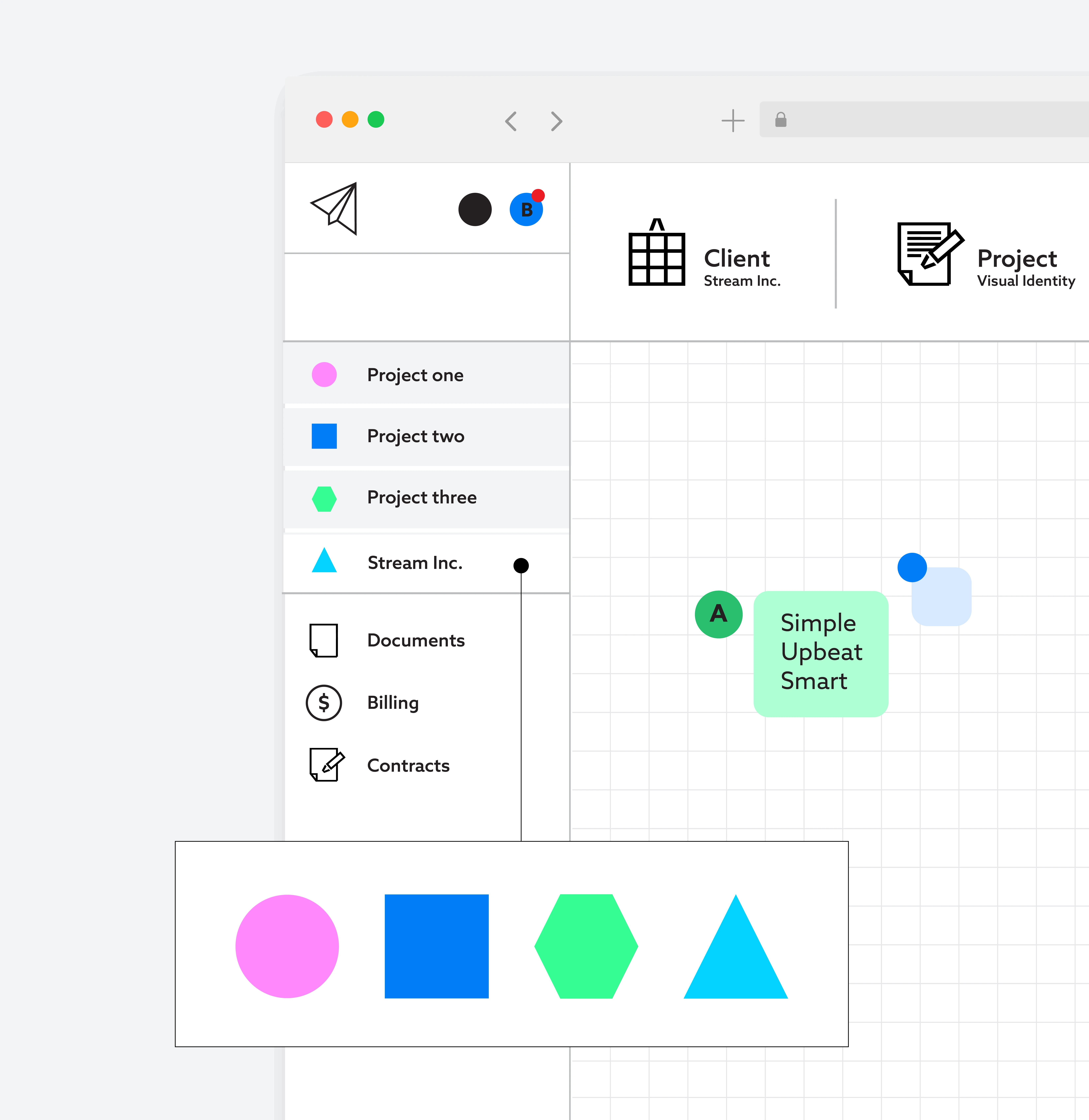
The graphic elements come directly from the product's UI. I wanted the navigation and categories to be designated by colorful shapes in line with the brand's playful nature and as a super accessible way to organize and access things within the app.
Graphic Elements & UI
The graphic elements come directly from the product's UI. I wanted the navigation and categories to be designated by colorful shapes in line with the brand's playful nature and as a super accessible way to organize and access things within the app.
Graphic Elements & UI
The graphic elements come directly from the product's UI. I wanted the navigation and categories to be designated by colorful shapes in line with the brand's playful nature and as a super accessible way to organize and access things within the app.
Graphic Elements & UI
The graphic elements come directly from the product's UI. I wanted the navigation and categories to be designated by colorful shapes in line with the brand's playful nature and as a super accessible way to organize and access things within the app.
Graphic Elements & UI
The graphic elements come directly from the product's UI features. I wanted the navigation and categories to be designated by colorful shapes in line with the brand's playful nature and as a super accessible way to organize and access things within the app.
Graphic Elements & UI
The graphic elements come directly from the product's UI features. I wanted the navigation and categories to be designated by colorful shapes in line with the brand's playful nature and as a super accessible way to organize and access things within the app.
Graphic Elements & UI
The graphic elements come directly from the product's UI. I wanted the navigation and categories to be designated by colorful shapes in line with the brand's playful nature and as a super accessible way to organize and access things within the app.
Graphic Elements & UI
The graphic elements come directly from the product's UI features. I wanted the navigation and categories to be designated by colorful shapes in line with the brand's playful nature and as a super accessible way to organize and access things within the app.
Graphic Elements & UI
The graphic elements come directly from the product's UI features. I wanted the navigation and categories to be designated by colorful shapes in line with the brand's playful nature and as a super accessible way to organize and access things within the app.
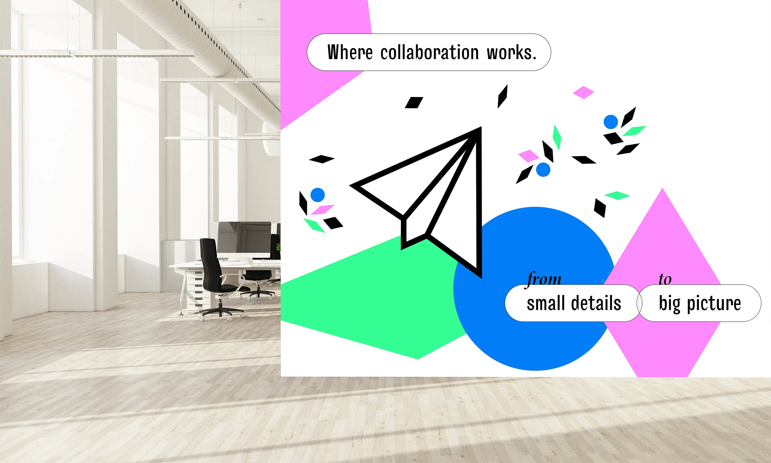
"from small details to big picture" is central to Mika, which I simply illustrated by scaling down the graphic elements.
"from small details to big picture" is central to Mika, which I simply illustrated by scaling down the graphic elements.
"from small details to big picture" is central to Mika, which I simply illustrated by scaling down the graphic elements.
"from small details to big picture" is central to Mika, which I simply illustrated by scaling down the graphic elements.
"from small details to big picture" is central to Mika, which I simply illustrated by scaling down the graphic elements.
"from small details to big picture" is central to Mika, which I simply illustrated by scaling down the graphic elements.
Graphic Elements: Scaled down
As I worked on the roll-out, I began asking questions, such as: what makes a project successful? Why is collaboration necessary? The idea of small details and big picture kept coming back to me—that collaboration is necessary in order for both things to be developed successfully.
Graphic Elements: Scaled down
As I worked on the roll-out, I began asking questions, like what makes a project successful? Why is collaboration necessary? And this idea of small details and big picture kept coming back to me. In that, collaboration is necessary in order to deliver both these things. A project is successful when the details, as well as the big picture, are well-developed.
Graphic Elements: Scaled down
As I worked on the roll-out, I began asking questions, such as: what makes a project successful? Why is collaboration necessary? The idea of small details and big picture kept coming back to me—that collaboration is necessary in order for both things to be developed successfully.
Graphic Elements: Scaled down
As I worked on the roll-out, I began asking questions, such as: what makes a project successful? Why is collaboration necessary? The idea of small details and big picture kept coming back to me—that collaboration is necessary in order for both things to be developed successfully.

06 Icons
06 Icons
06 Icons
06 Icons
06 Icons
06 Icons
Before
Before
Before
Before
Before
Before
Before


01 Before

02 Before

04 Before
03 Before
Based on some inspiring feedback, my icons became more uniquely integrated into the brand.
Based on some inspiring feedback, my icons became more uniquely integrated into the brand.
Based on some inspiring feedback, my icons became more uniquely integrated into the brand.
Based on some inspiring feedback, my icons became more uniquely integrated into the brand.
Based on some inspiring feedback, my icons became more uniquely integrated into the brand.
Based on some inspiring feedback, my icons became more uniquely integrated into the brand.
Based on some inspiring feedback, my icons became more uniquely integrated into the brand.
Based on some inspiring feedback, my icons became more uniquely integrated into the brand.
Based on some inspiring feedback, my icons became more uniquely integrated into the brand.
After
After
After
After
After
After
After


01 Update

06 Update

04 Update

03 Update

03 Update

05 Update

07 Update

02 Update
07 Application
07 Application
07 Application
07 Application
07 Application
07 Application